
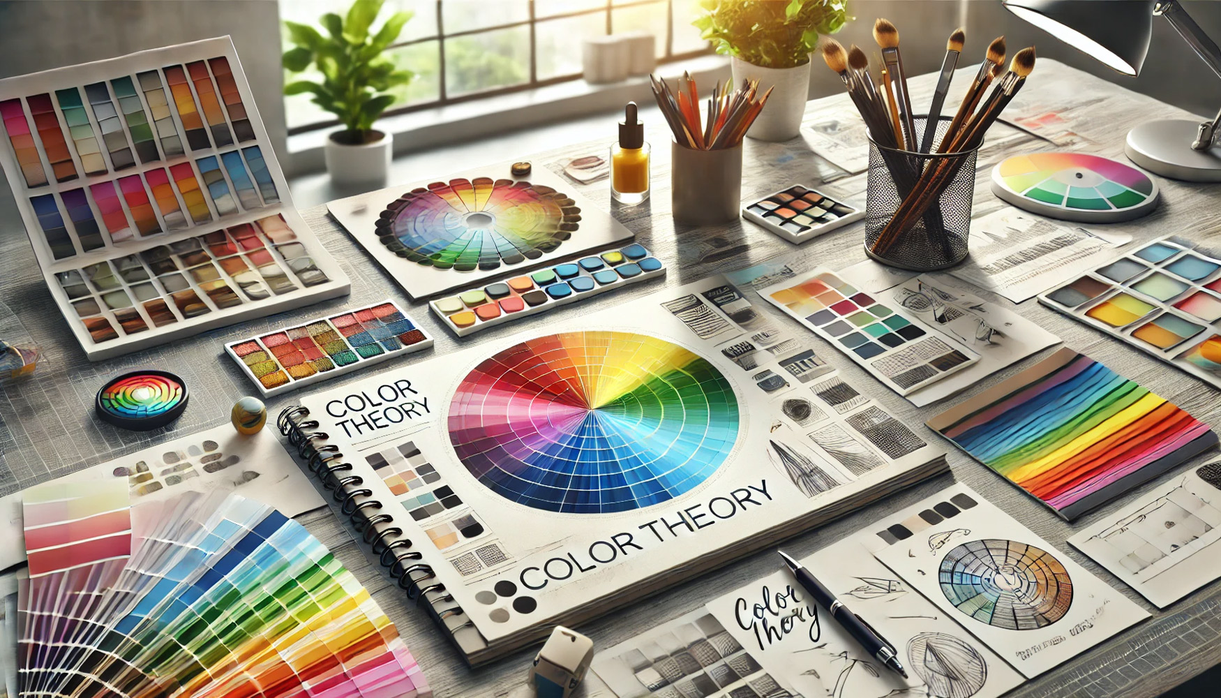


This rule is based on using a single color in its various shades, from light to dark. It’s an ideal approach for achieving a clean and calm design. Example: Using different shades of blue—from navy to sky blue—in the design of a medical website or an official page. The Advantage: It enhances a sense of consistency and visual harmony.
This rule relies on selecting two colors that are directly opposite each other on the color wheel. This approach emphasizes contrast and captures attention. Example: Orange and blue, or red and green, used in the design of an advertisement or a logo. The Advantage: Perfect for headlines or buttons you want to highlight.
This rule uses three colors that are evenly spaced on the color wheel, forming an equilateral triangle. It provides a dynamic yet balanced color scheme. Example: Red, yellow, and blue in a promotional poster or a children’s design. The Advantage: Vibrant colors that maintain harmony without clashing.
This rule involves using three colors that are adjacent to each other on the color wheel. It evokes a sense of natural harmony. Example: Green, yellow-green, and blue-green in interior design or a nature-themed poster. The Advantage: Easy to blend and provides visual calmness.
This rule combines three adjacent colors with one complementary (opposite) color, adding a bold and distinctive touch. Example: Violet, blue-violet, and blue with a splash of yellow. The Advantage: A balanced mix of harmony and contrast.
This rule involves selecting a base color along with the two colors adjacent to its complement. It offers a soft contrast without being too intense. Example: Orange with blue-green and blue-violet. The Advantage: Suitable for balanced and modern designs.
This rule uses four colors consisting of two complementary pairs, forming a rectangle on the color wheel. Example: Blue and orange combined with red and green. The Advantage: Rich in color and ideal for bold, complex designs.
تعتمد هذه القاعدة على استخدام لون واحد بدرجاته المختلفة، من الأفتح إلى الأغمق. تعتبر هذه الطريقة مثالية للحصول على تصميم بسيط وهادئ. مثل : استخدام درجات الأزرق من الكحلي حتى السماوي في تصميم موقع إلكتروني طبي أو صفحة رسمية. والميزة: تعزز الشعور بالاتساق والتناغم البصري
تعتمد على اختيار لونين متقابلين تمامًا في عجلة الألوان. هذه الطريقة تُبرز التباين وتجذب الانتباه. مثل : برتقالي وأزرق، أحمر وأخضر في تصميم إعلان أو شعار . والميزة: مثالية للعناوين أو الأزرار التي تريد إبرازها
تُستخدم فيها ثلاثة ألوان تكون موزعة بشكل مثلث متساوي الأضلاع على عجلة الألوان، وتوفر توازنًا لونيًا ديناميكيًا. مثل : الأحمر، الأصفر، والأزرق في ملصق دعائي أو تصميم للأطفال. والميزة: ألوان نابضة بالحياة دون أن تكون متنافرة
تتضمن استخدام ثلاثة ألوان متجاورة على عجلة الألوان. توحي هذه القاعدة بالانسجام الطبيعي. مثل: أخضر، أصفر-أخضر، وأزرق-أخضر في تصميم داخلي أو بوستر طبيعي. والميزة: سهلة الدمج وتمنح هدوء بصري
نستخدم ثلاثة ألوان متجاورة بالإضافة إلى لون متقابل معها، مما يُضفي لمسة جريئة ومميزة. مثل: بنفسجي، أزرق بنفسجي، أزرق، مع أصفر. والميزة: توازن بين الانسجام والتباين
نختار لونًا أساسيًا ثم اللونين المجاورين للونه المكمل. تمنح هذه الطريقة تباينًا خفيفًا بدون حدة. مثل: برتقالي مع أزرق-أخضر وأزرق-بنفسجي. والميزة: مناسبة لتصاميم متوازنة وعصرية
تعتمد على استخدام أربعة ألوان مكونة من زوجين من الألوان المكملة، وتُشكل مستطيلًا على عجلة الألوان. مثل: أزرق وبرتقالي مع أحمر وأخضر. والميزة: غنية لونيًا وتناسب التصاميم الجريئة والمعقدة
Click on my contact below to chat on WhatsApp


نوارة باش مهندس عمران
ربي يعطيك الصحة يا غالي وطولة العمر
دائما نستفيد منك
اهلا وسهلا بيك سيد عوض .. يسعدني مرورك ومتابعتك يا عزيزي